SwiftUI on iPad:添加工具栏、标题等
SwiftUI on iPad: Add toolbars, titles, and more
2022年6月6日
一句话判断
这可能是今年最实用的 SwiftUI Session 之一——苹果终于把 iPad 上的工具栏、导航标题、overflow 菜单这些细节都补齐了,让你的 iPad App 不再像个放大版的 iPhone App。
这场 Session 讲了什么
SwiftUI 在 iPad 上的工具栏支持一直是短板。iOS 16 / iPadOS 16 补上了大量缺失的 API,让开发者能精细控制 iPad 屏幕上各种 UI 元素的布局。Session 重点讲了以下几个方面:
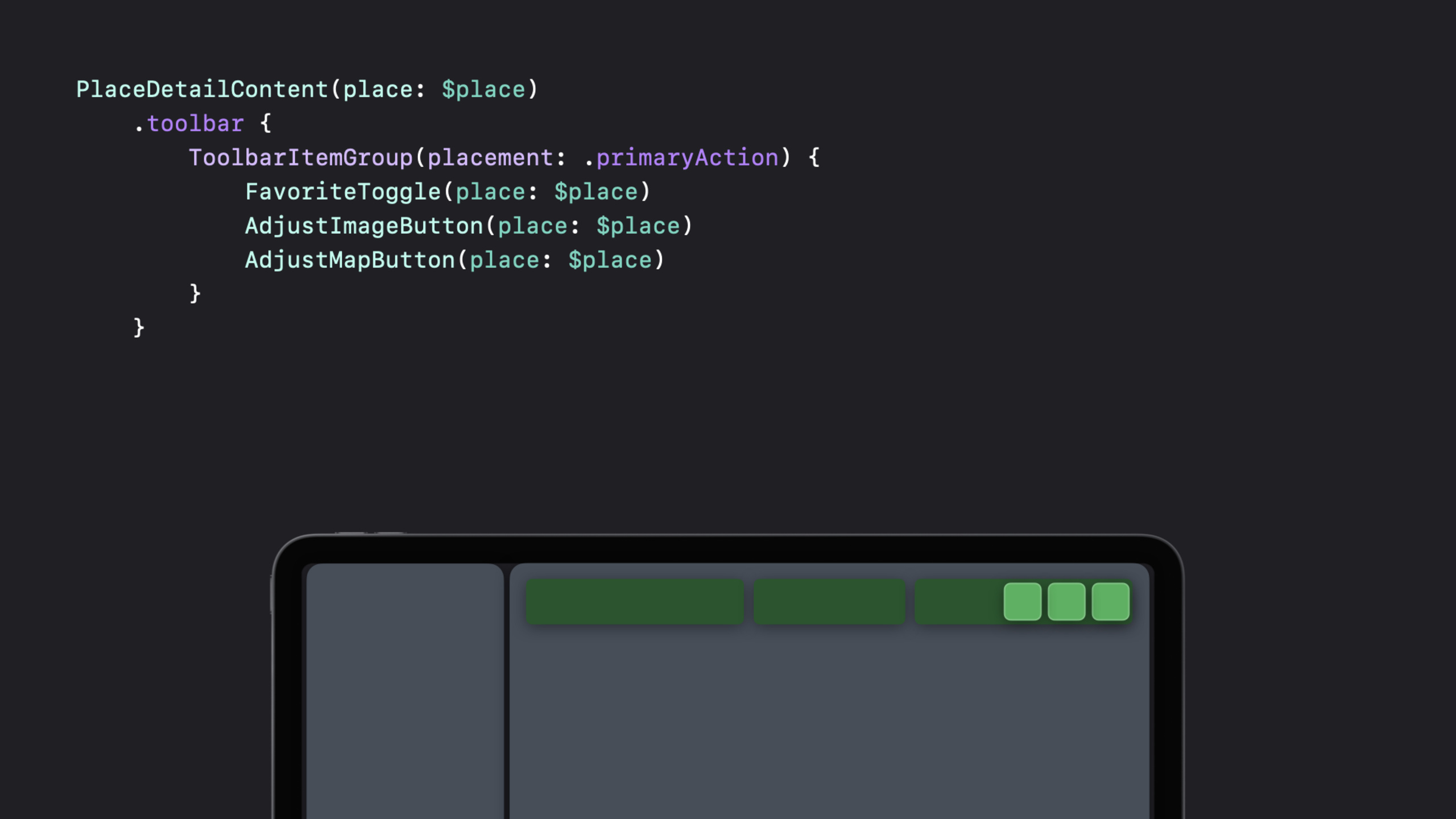
工具栏的 overflow 菜单。 当工具栏按钮太多放不下时,iPad 上会自动出现一个 overflow 菜单(三个点的按钮),多余的选项会折叠进去。开发者现在可以用 ToolbarItem 的 placement 参数来精确控制每个按钮的位置。
toolbarRole(.editor) 和次要操作。 新的 toolbarRole 修饰符让你指定工具栏的角色类型。.editor 角色会改变工具栏的布局方式,把次要操作放到合适的位置。这是一个语义化的 API,告诉系统”这个工具栏是用来编辑内容的”,系统会据此做出合适的布局决策。
导航标题菜单。 现在可以给导航标题加上一个菜单,用户点击标题时弹出选项列表。这在 iPad 上特别有用——标题栏有足够的点击区域。
ControlGroup。 新的 ControlGroup 容器可以把多个按钮组合在一起,在视觉上形成一个整体。适合把相关操作归到一组。
navigationDocument。 新的修饰符让你在标题栏显示当前打开的文档名称,系统会自动处理标题的展示方式。
值得深挖的点
语义化的工具栏 API 是正确方向。 苹果没有让你手动计算按钮的布局位置,而是通过 placement 和 role 这样的语义化参数来描述意图。系统会根据设备类型、屏幕方向、可用空间来自动决定最佳的布局。这种”描述意图而非描述实现”的设计哲学贯穿了 SwiftUI 的整个工具栏体系。
工具栏自定义是用户期待已久的功能。 iPad 用户一直期望能像 macOS 一样自定义工具栏按钮的排列。iOS 16 的底层 API 已经为这个能力做好了准备,虽然目前 SwiftUI 层面还没有直接暴露自定义拖拽排序的 API,但 ToolbarItem 的架构设计明显预留了这个扩展空间。
代码片段
struct DocumentEditorView: View {
    let document: Document

    var body: some View {
        NavigationStack {
            DocumentContent(document: document)
                .navigationTitle(document.name)
                .navigationDocument(document.url)
                // 编辑器角色的工具栏
                .toolbar {
                    ToolbarItemGroup(placement: .primaryAction) {
                        Button(action: formatText) {
                            Label("Format", systemImage: "textformat")
                        }
                        Button(action: insertImage) {
                            Label("Insert", systemImage: "photo")
                        }
                    }
                    // 次要操作会自动进入 overflow 菜单
                    ToolbarItemGroup(placement: .secondaryAction) {
                        Button(action: shareDocument) {
                            Label("Share", systemImage: "square.and.arrow.up")
                        }
                        Button(action: printDocument) {
                            Label("Print", systemImage: "printer")
                        }
                    }
                }
                .toolbarRole(.editor)
                // 导航标题菜单
                .navigationBarTitleMenu {
                    Button("Rename") { renameDocument() }
                    Button("Duplicate") { duplicateDocument() }
                    Button("Move...") { moveDocument() }
                }
        }
    }
}

// ControlGroup 示例
.toolbar {
    ToolbarItemGroup(placement: .primaryAction) {
        ControlGroup {
            Button(action: undo) {
                Label("Undo", systemImage: "arrow.uturn.backward")
            }
            Button(action: redo) {
                Label("Redo", systemImage: "arrow.uturn.forward")
            }
        }
    }
}
最佳实践
- 使用语义化的
placement参数(如.primaryAction,.secondaryAction,.navigation)而非硬编码位置,这样系统在不同设备和方向下能做出正确的布局决策。 - 次要操作用
.secondaryAction,系统会自动把它们放到 overflow 菜单里,而不是试图在工具栏上挤下所有按钮。 toolbarRole(.editor)要用在确实有编辑操作的场景,它会影响工具栏的整体视觉风格。- iPad 上要测试横屏和竖屏两种方向的工具栏布局,因为可用空间差异很大。
还有什么值得关注
navigationDocument会自动在标题旁显示一个文档图标,用户点击可以查看文件信息。- ControlGroup 在 visionOS(当时还没公布,但 API 设计上已经为未来设备做好了准备)上可能有不同的视觉呈现。
- 工具栏按钮的
Label同时提供了文字和图标,系统会根据可用空间决定显示哪一个。 - 如果你从 UIKit 迁移,SwiftUI 的工具栏 API 对应的是
UIToolbar和UINavigationItem的组合。