认识 UIKit 按钮系统
Meet the UIKit button system
2021年6月10日
一句话判断
UIButton.Configuration 是 UIKit 对「现代按钮」的正式回答——终于不用在 setTitle、setImage、setBackgroundColor 之间反复横跳了,一个 struct 搞定所有配置。
这场 Session 讲了什么
UIKit 的按钮 API 在历史上经历过多次迭代:从 UIButton(type:) 到 init(frame:) 再到现在的 UIButton.Configuration。这场 Session 专门讲解新的配置化按钮系统。
UIButton.Configuration 是一个值类型的配置结构体,包含了按钮的所有视觉属性:标题、副标题、图标、背景色、圆角、间距、内边距。修改配置不会直接修改按钮——你需要把新的 configuration 赋值给按钮的 configuration 属性。
系统提供了几种预设配置:.filled()(实心填充)、.tinted()(带底色的透明按钮)、.gray()(灰色背景)、.bordered()(带边框)、.borderedTinted()(带边框和底色)、.borderedProminent()(醒目边框)。这些预设对应了 Apple Human Interface Guidelines 中的按钮样式。
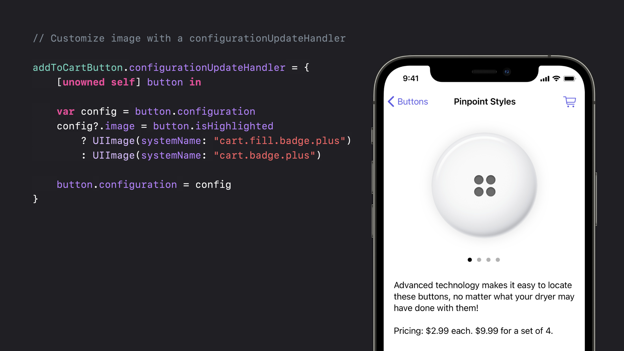
Session 重点介绍了 configurationUpdateHandler——一个在按钮状态变化时自动调用的闭包。你可以在这里根据按钮的 state(normal、highlighted、disabled、selected)动态更新配置。
值得深挖的点
Configuration 与旧 API 的共存
UIButton.Configuration 和旧的 titleLabel、imageView、backgroundColor API 可以共存,但不建议混用。如果你设置了 configuration,旧的 API 设置可能会被忽略。建议在新代码中完全使用 Configuration API,不要和旧 API 混用。
动画和过渡
按钮的状态变化(比如从 normal 到 highlighted)默认有平滑的动画。这是因为 UIButton 内部使用了 UIConfigurationTransform 来插值不同状态之间的差异。如果你想要自定义的过渡效果,可以在 configurationUpdateHandler 中使用 UIView.animate。
代码片段
// 创建不同风格的按钮
func createButtons() -> [UIButton] {
    // 主要操作按钮 - 实心填充
    var filledConfig = UIButton.Configuration.filled()
    filledConfig.title = "确认购买"
    filledConfig.subtitle = "¥99.00"
    filledConfig.image = UIImage(systemName: "cart.fill")
    filledConfig.imagePlacement = .leading
    filledConfig.imagePadding = 8
    filledConfig.cornerStyle = .capsule
    let filledButton = UIButton(configuration: filledConfig, primaryAction: purchaseAction())

    // 次要操作按钮 - 带边框
    var borderedConfig = UIButton.Configuration.bordered()
    borderedConfig.title = "取消"
    borderedConfig.cornerStyle = .capsule
    let borderedButton = UIButton(configuration: borderedConfig, primaryAction: cancelAction())

    // 危险操作按钮 - 红色
    var dangerConfig = UIButton.Configuration.filled()
    dangerConfig.title = "删除"
    dangerConfig.image = UIImage(systemName: "trash")
    dangerConfig.baseBackgroundColor = .systemRed
    dangerConfig.baseForegroundColor = .white
    let dangerButton = UIButton(configuration: dangerConfig, primaryAction: deleteAction())

    // 灰色按钮 - 禁用状态
    var disabledConfig = UIButton.Configuration.gray()
    disabledConfig.title = "稍后再说"
    let disabledButton = UIButton(configuration: disabledConfig)
    disabledButton.isEnabled = false

    return [filledButton, borderedButton, dangerButton, disabledButton]
}
// 状态驱动的按钮配置更新
class FormViewController: UIViewController {
var submitButton: UIButton!
func setupButton() {
var config = UIButton.Configuration.filled()
config.title = "提交"
config.buttonSize = .large
config.cornerStyle = .large
submitButton = UIButton(configuration: config)
submitButton.configurationUpdateHandler = { [weak self] button in
guard let self = self else { return }
var config = button.configuration
switch button.state {
case .highlighted:
// 按下时稍微缩小并变暗
config?.titleTextAttributesTransformer = UIConfigurationTextAttributesTransformer { incoming in
var outgoing = incoming
outgoing.foregroundColor = .white.withAlphaComponent(0.8)
return outgoing
}
case .disabled:
config?.baseBackgroundColor = .systemGray4
config?.title = "表单不完整"
case .selected:
config?.baseBackgroundColor = .systemGreen
config?.title = "已提交"
default:
config?.baseBackgroundColor = .systemBlue
config?.title = "提交"
}
button.configuration = config
}
}
func validateForm() {
submitButton.isEnabled = isFormValid
}
}// 带图标的复合按钮布局
func createIconButton() -> UIButton {
var config = UIButton.Configuration.tinted()
config.title = "分享到"
config.image = UIImage(systemName: "square.and.arrow.up")
config.imagePlacement = .top // 图标在上方
config.imagePadding = 4
config.titleAlignment = .center
config.buttonSize = .small
// 自定义图标大小
config.imageTextPadding = 2
let button = UIButton(configuration: config)
return button
}最佳实践
使用 UIButton.Configuration 时,尽量用预设配置作为起点,然后通过属性修改来定制。不要从空的 UIButton.Configuration() 开始——预设配置已经包含了正确的间距、字体和圆角设置。
如果你的按钮需要频繁更新标题(比如倒计时按钮),直接修改 configuration?.title 并赋值回去。这比旧的 setTitle(_:for:) 更高效,因为 configuration 是值类型,修改和赋值的开销很小。
还有什么值得关注
UIButton.Configuration支持activityIndicator属性,可以在按钮中显示加载指示器。background.backgroundColorTransformer可以自定义背景色在不同状态下的变化方式。- 在 Mac Catalyst 中,
UIButton.Configuration的按钮会自动适配 macOS 的视觉风格。